
“Indoor Air Quality monitoring via soothing digital art to control your air quality aesthetically without over-stressing about it.
What is it and motivation behind the idea
Indoor Air quality (IAQ) depends on numerous factors which includes the following:
- Temperature: if the temperature is too hot or too cold indoor, it can create discomfort and can impact both our physical and mental health. For example, it can lead to respiratory distress, sleep deprivation and/or depression.
- Humidity: depending on the humidity levels indoor, people are more susceptible to airborne pollutants such as allergens, mold, mildew, and viruses. It also directly impacts the comfort.
- Particles: PM2.5 are particles of a diameter of 2.5 micrometres or smaller. Due to their size, they are inhalable and are small enough to pass through the lungs, into the bloodstream, and into your organs. High continuous exposure can lead to premature mortality and respiratory diseases. The main sources are dust, smoke and fuel combustion.
- VOCs presence: VOC stands for Volatile organic compounds. They are gases containing different chemicals that can be harmful but not all of them are. For example, cleaning agents, paint and fuels are VOCs. For health and smell, it is recommended to ventilate the room if high levels are detected.
Those factors and their consequences can be pretty scary, but my idea is to enable people to monitor their indoor air quality with as less stress as possible. As a user, I am sometimes stressed and overwhelmed by numbers, especially when it is hard to tell if they are good or bad. Same way, red/orange/green type of interfaces stress me out because red and orange colors create a sense of urgency and very bad situation feelings while most of the times, it just indicates that a window needs to be opened or the HVAC system needs to be adjusted a little bit.
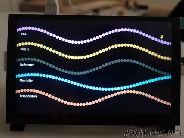
That’s why I chose sinusoidal curves to represent each factor. The higher the frequency means the higher the value compared to a reference curve. If the value is on the low side, the frequency will be lower than the reference curve.
Example below: The blue curve which is humidity has a lower frequency that the reference: it means that it would be a good idea to turn on the humidifier. No numbers, no red colors, just the user seeing a curve smoother than another one and who can associate it with a simple action item. All other factors are in sync with the reference curves.”