
“A project to improve data visualization ended up overturning a century-old model of color space that underpins industry standards for color everywhere from digital displays to paint.
The opportunity to correct the work of Nobel Prize-winning physicist Erwin Schrödinger—yes, that Schrödinger, of quantum cat fame—comes once in a lifetime, so when my colleagues and I discovered he and others were wrong in their mathematical description of how people perceive color, we jumped on it.
In my early-career research project, our scientific visualization team at Los Alamos National Laboratory wanted to develop algorithms to automatically improve the color maps underlying the images and movies that make data—numbers—easy to understand and interpret at a glance. Our minds have trouble digging meaning out of arrays of digits, but we can quickly spot patterns and trends when those numbers are converted to pictures, with colors representing different values in the data. Our visualizations help physicists, climate modelers, space weather researchers and many others make sense of vast data streams that might otherwise bury their revelations beneath seemingly endless spreadsheet columns.
Interpreting data in a visualization depends strongly on the quality of the color map, which assigns colors to data values. A continuous color map follows a path through color space. We thought we could automate the design of color maps if we treated them as pure geometric objects and mathematically captured what makes a good colormap. For that to work, you have to have a color model that really captures human perception. We wanted to use the century-old model developed by Schrödinger and others.
Early in the project, we encountered a contradiction. The problem was the so-called “principle of diminishing returns”—more on that later—that had been measured in experiments and used to support the argument that a simpler model was not sufficient to describe human color perception; we found it violated the prevailing model that traced back to Schrödinger, too. The model just wasn’t working. As we probed the problem, we discovered—and proved—that the particular branch of geometry underpinning the model couldn’t account for how people actually distinguish different colors.
A quantum leap to color perception?
It might seem like a quantum leap to connect Schrödinger to color perception, but in the early 20th century, at the urging of the great mathematician Bernhard Riemann, Hermann von Helmholtz and Schrödinger developed a geometrical representation of how we distinguish colors in the eye and the mind.
Before that, the first mathematical model for treating color established a space defined by the familiar, straight-line-based Euclidean geometry. The space is spanned by three primaries, such as red, blue and green—the colors registered dominantly by the light-detecting cones on our retinas. That model is the foundation of most industry standards for color everywhere from textiles to paint, from printing to digital displays. But it fails to provide a reliable metric. The mathematical distance between two colors in the color space does not match their perceived difference by a human. Drawing on Riemannian geometry, von Helmholtz and Schrödinger developed a mathematical model that can describe color as a curved space. This model is far better because it can encompass many phenomena that have been seen in experiments.
Riemannian geometry allows generalizing straight lines to curved spaces. The most familiar example might be airline-route maps showing curved lines connecting cities. For instance, the shortest distance from Seattle to Amsterdam goes through Reykjavik, Iceland. Following those curved line segments of Riemannian geometry—this will be important later—the Seattle to Reykjavik leg plus the Reykjavik to Amsterdam leg equals the total distance from Seattle to Amsterdam.
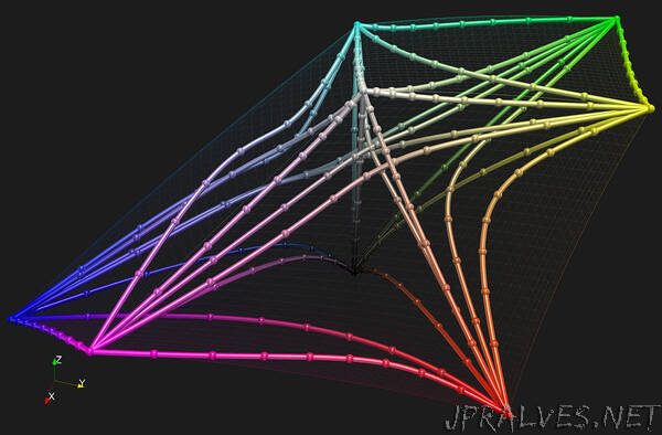
In the Riemannian model of color perception, one can measure the difference we perceive between two shades of a color by drawing a curve tracing the shortest distance between the coordinates of each color in 3D space. A bigger perceived difference in color requires a longer curve.
Suppose you take two colors and then pick one that lies on the shortest path between them—say, magenta in the middle, purple to the right and pink to the left. Then you measure the paths from magenta to purple and from magenta to pink. The sum of those two path segments should equal the length of the whole path drawn from magenta to pink, representing the perceived difference between those two colors. It should add up, just like the flight distances from Seattle through Reykjavik to Amsterdam.
But it doesn’t. That’s because of the principle of diminishing returns, detected in experiments in the 1960s. The principle suggests that a Riemannian setting overestimates the perceived difference between widely separated colors—in simple language, the short lines don’t add up, a diminishing return.
Finding a new paradigm
To our surprise, no one else had found that the color space was not, in fact, Riemannian, which had been the key to Schrödinger’s model. Quite the opposite. As we dug deeper, we found several places suggesting that the principle of diminishing returns might not be real. We wanted to verify it and ran our own experiment with people. We set up a series of 320 triads, like the purple-magenta-pink example above. Next we asked people which test color is more different from the middle, reference color. We then converted the responses to a metric in color space. We found that indeed adding the small differences, say, purple to magenta and magenta to pink, didn’t equal the length—or perceived difference—all the way from purple to pink. The total path was too short. Apparently, we humans are wired to more carefully discern small color differences than big ones. It is as if we had a natural contrast enhancer to emphasize nuances between similar colors.
The problem with the Schrödinger’s model is that Riemannian geometry can’t account for this perception. The model is inherently additive, like in the Reykjavik example. Instead, and sticking with our example, Riemannian geometry consistently overestimates the difference from purple to pink compared to how people actually perceive it. Developing a model that correctly represents that color difference could improve the accuracy of color image metrics and help with compression algorithms, which would save on bandwidth for streaming video, just to give one example.
The question remains, though: what mathematical model does accurately reflect color perception? We have a few ideas that we’re pursuing, such as applying a weighing function to the Riemannian distance to approximate the real perceived difference. We hope to have the answer soon.
The Paper: The non-Riemannian nature of perceptual color space, in Proceedings of the National Academy of Sciences, by Roxana Bujack, Emily Teti, Jonah Miller, Elektra Caffrey, and Terece L. Turton. https://www.pnas.org/doi/10.1073/pnas.2119753119#sec-8”